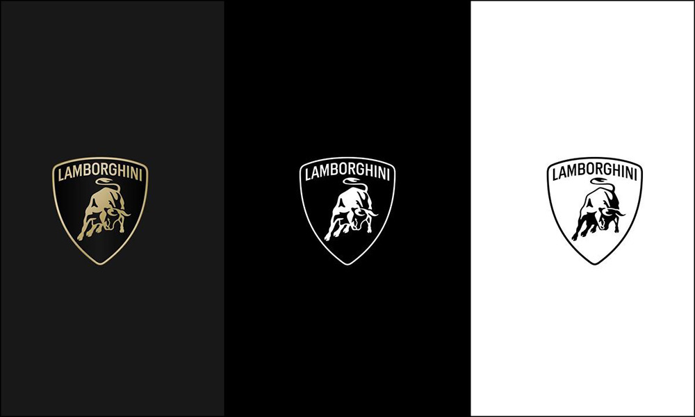
Supercar maker Lamborghini has given its iconic logo a makeover for the first time in 20 years, but you have to look really close to see the differences.
The origin of the brand’s raging bull logo goes right back to company founder Ferruccio Lamborghini. Legend has it that he was a fan of bullfighting, and admired the ferociousness of the animals so much that he decided to make one the focal point of his brand identity.
Now, this world-famous badge has received a bit of a makeover to—as the firm’s PR department puts it—better reflect the brave, authentic, and unexpected values of its current mission.
That mission is called “Driving Humans Beyond,” and forms part of a broader transformation process and strategy called Direzione Cor Tauri that has decarbonization and sustainability at its core.
Yes, even brutal Italian supercars are now surfing the green wave, and will try to be more environmentally friendly in the future. Bosses at Lambo thought this new direction calls for a new corporate identity, and so here it is.
In case you’re now struggling to spot the differences from the old logo, let us enlighten you (after we’ve checked the press release ourselves to see what has actually changed).
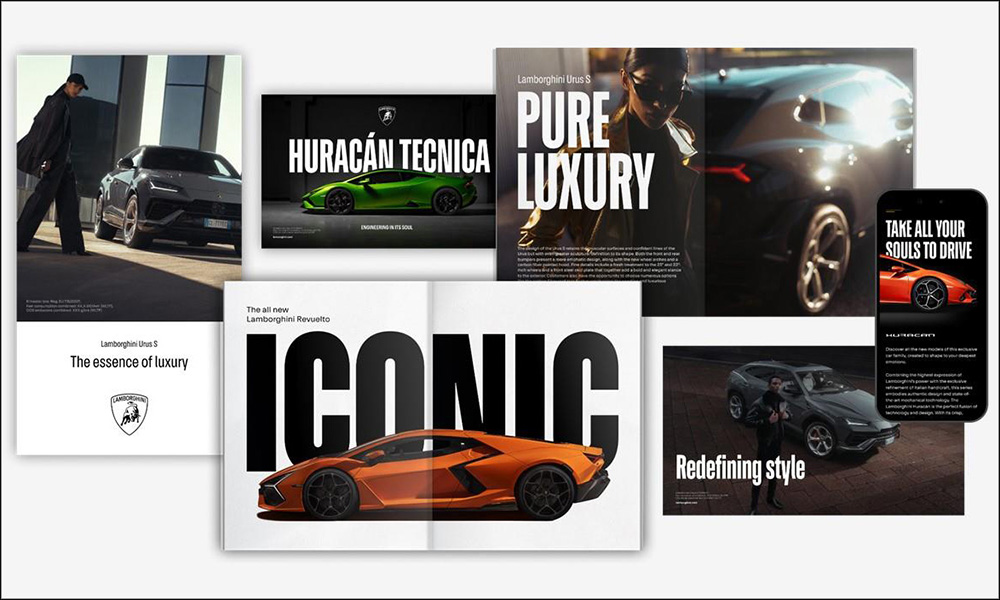
The new logo features a broader Lamborghini typeface and fewer colors. Black and white are the primary hues, while yellow and gold are used as accent colors.
The bull itself has also been tweaked, and will now for the first time ever appear on its own—meaning without the shield—on the company’s website and social media channels. This free-running bull is joined by an entire official Automobili Lamborghini typeface that the company will be using in its communications.
The subtle rebranding exercise is rounded off by a new set of icons developed in cooperation with Lamborghini Centro Stile that you’ll be able to admire across the firm’s online content soon.





Comments