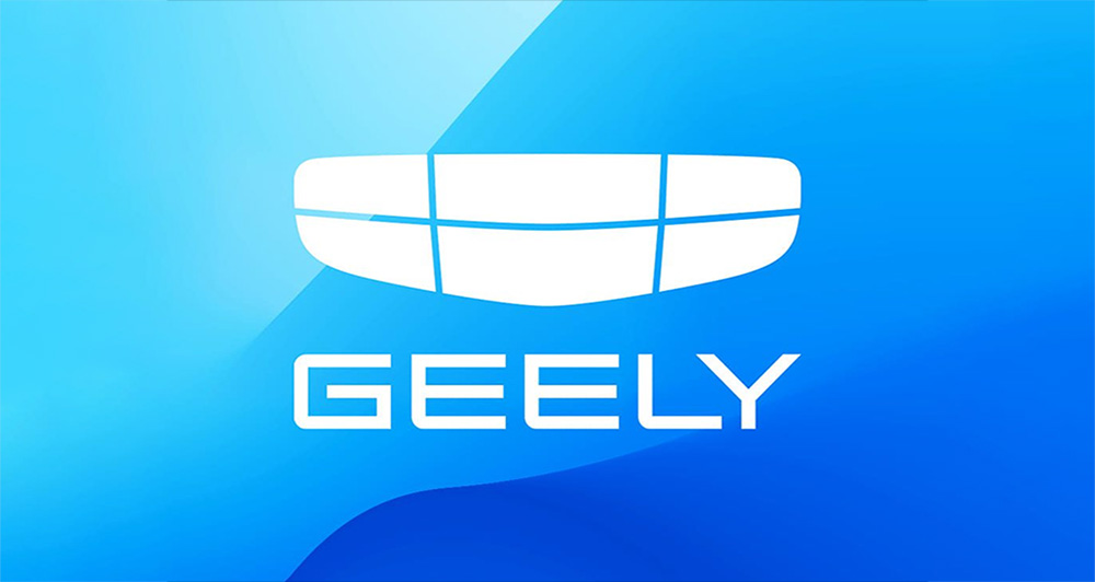
Minimalism and flat surfaces seem to be the trend of the new millennium, as evidenced by the iconography, the designs, and the logos we see around us. Automotive manufacturers have started flattening out their logos, with some like Peugeot and Nissan having slicker new badges that retain their identities. On the other hand, companies like Kia have been met with some confusion.
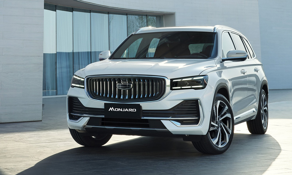
The latest company to join the bandwagon is Geely. Its new logo is simply a flat, white version of its current logo. Not that it’s a bad thing, since its logo was already relatively clean and iconic enough to be recognized. We’re not even sure if the automaker needed to change how its logo looked on its cars, since the old and new logos look already pretty similar in terms of design.
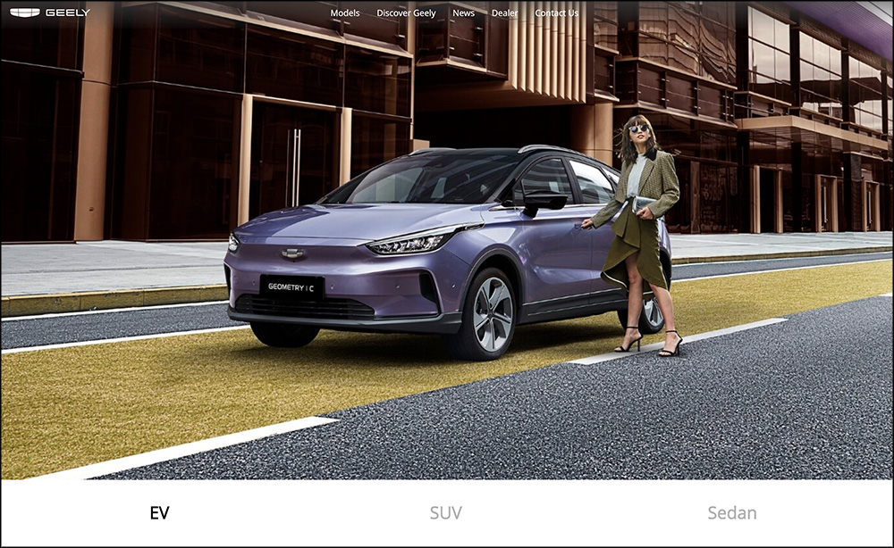
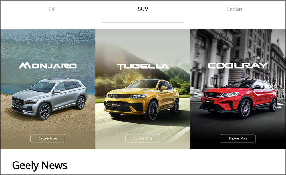
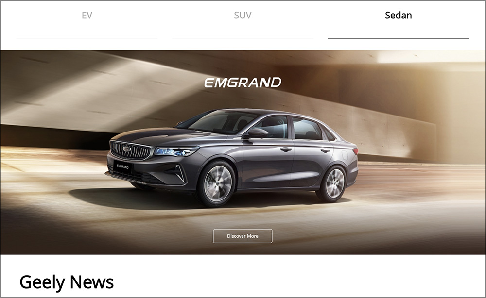
Aside from a new logo, the automaker has given its international website a fresh, new look, showcasing several cars such as the Geometry C EV, the Monjaro, the Tugella, the Coolray, and the Emgrand.
While this is not indicative of what cars Geely Philippines will bring to our shores, we’re hoping that the brand introduces some of these vehicles to our market this year.




Comments