Many people will argue that traffic in Metro Manila can sometimes seem lawless. But how can you abide by the rules if they are often unclear or badly communicated? Let’s take road signs for example.
Contrary to what some people might think, there are actually very good guidelines defined by the Department of Public Works and Highways in line with international standards.
Yet drive around the city and you’ll often find signs that don’t seem to match these rules. Signage is frequently unclear, missing, badly positioned, or of a type not officially approved for use on public roads.
This leaves the door open for mistakes and abuse, and makes driving here even harder. Don’t just take our word for it, though.
The DPWH guidelines literally say: “A standardized road traffic system is essential to ensure that drivers acquire the information necessary to enable them to comply with road regulations and to navigate their way around the road system in a safe and efficient manner.”
We’ve noticed problems with this for a long time, and not just since we started investigating alleged ticket traps (which often involve unclear or missing road signage). Below are a few examples of less-than-ideal road signage in Metro Manila, and we hope that national and local authorities will spend more time and attention on this topic in the future to create a better environment for everyone.
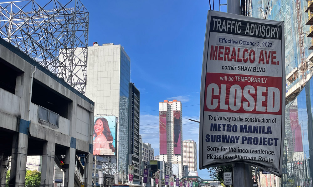
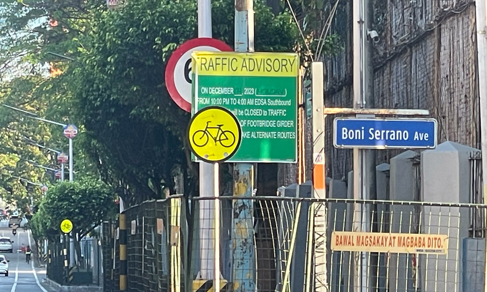
Let’s start with my personal pet hate: DIY road signs that are more advertisements than official traffic advisories. These should not even exist. They are, going by DPWH guidelines, not valid road signs.
To once again quote the agency: “No traffic signs shall bear any advertising or commercial message, or any other message that is not essential to traffic control…The display of unofficial, nonstandard, and nonessential signs is not permitted.” Yet, look around our roads, and there are loads of these things.
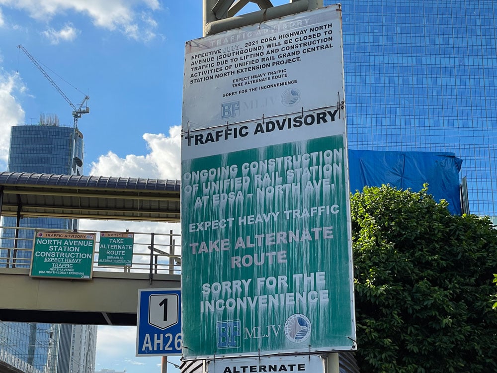
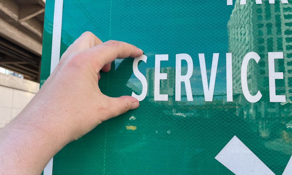
Most are printed on tarpaulin, which I would argue also makes them in breach of regulations. The guidelines clearly state that signs meant to convey information at night (which, if you think about it, are pretty much all of them) should be reflectorized or illuminated. Good luck reading some of the tarps masquerading as street signs around the metro during the day (never mind at night).
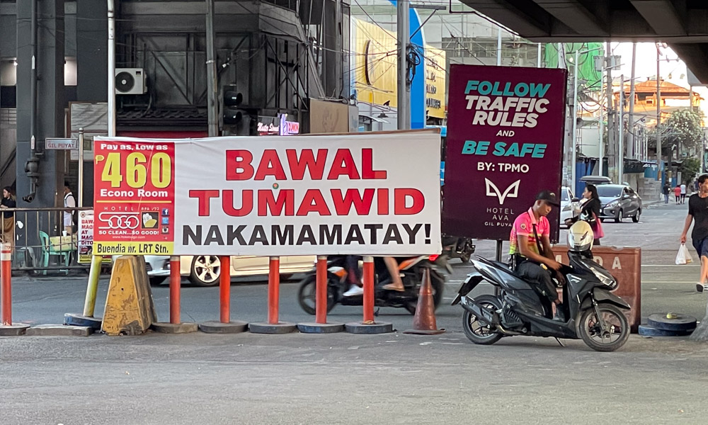
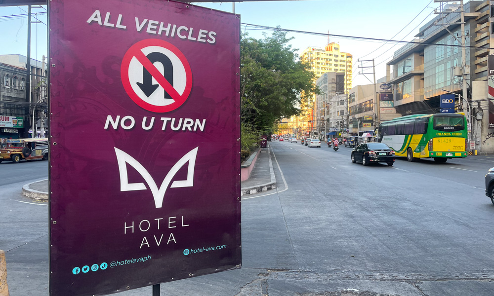
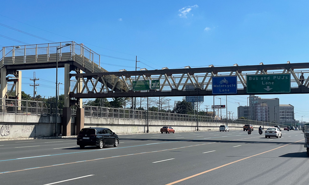
Then there’s the general visual clutter of the place. Take a drive down EDSA and try to count the number of roadside and overhead adverts.
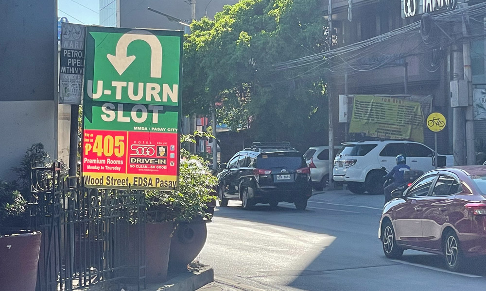
Not only are there loads of them all vying for your attention alongside actual traffic signs, but some also look very similar to official road signs. Just look at the multiple Grab ads that use almost the same green-and-white colors as official advanced direction signs.
Your brain has to work overtime to make sense of this visual chaos, and the results are increased stress levels and a driving environment that is less safe. No wonder people get caught out at U-turn slots if you have to play hide-and-seek with the signs telling you about them.
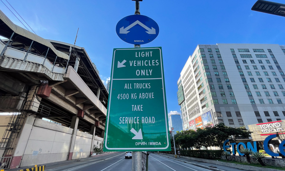
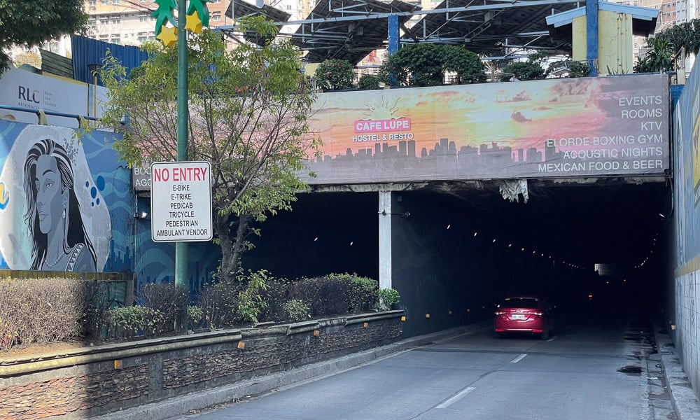
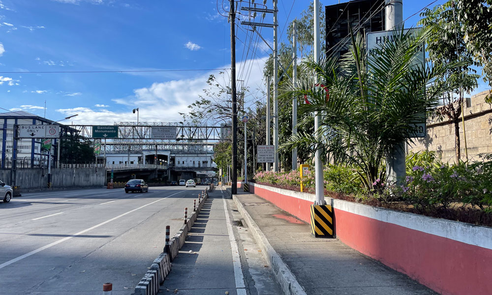
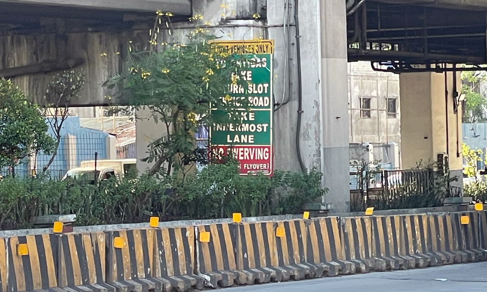
Another problem includes the many instances where signs are obscured, positioned wrongly, made too small or painted in the wrong colors. You can see numerous instances of this up and down EDSA alone (and plenty more elsewhere, I’m sure).
Direction, prohibition and instruction signs (among others) all have strictly defined color schemes that are not always being adhered to. Many of the signs also feature fonts that are way too small to read in time to react, or are positioned in places where—when you can read them—it’s too late to make a decision already.
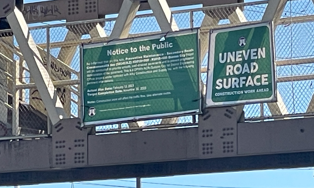
A special mention has to go to one particular sign here. Drive along Commonwealth into Quezon City, and try to read the “Notice to Motorists” attached to one of the footbridges. We couldn’t, even when standing on the sidewalk and zooming in with our phone camera.
This is an extreme example of a bad road sign, but sadly there are many more like it out there.
Some of you might say: “Who cares as long as the signs tell you what to do?” The issue with that is that the authorities base their enforcement actions on traffic signs, and if these are not standardized and are clear, then that’s neither fair nor appropriate or safe.
“But officer, I didn’t know there was no U-turn here!”
“Well, you should have looked at that hotel advert down the road that told you so!” is hardly the right way to do things, is it?
In fairness, having cycled around Metro Manila for more than a decade now and observed the roads in the process, I do get the feeling that things are slowly improving. They just need to improve a little more to create a more uniform and fairer playing field.
Once we have sorted road signage, we need to look at a universal set of traffic rules next, but that’s a whole new conversation for another time.


Comments